Design for context
Written by

Vignesh Balaji NV
We share articles internally that we find interesting to each other. Later, We would discuss the article. Recently, Vivek shared this piece called The Arc of Design. He liked this idea of how the writer presents the case of utility of interface design through the concept of game exploration.
It concludes with the following:
Do no harm. Make things clear. And show us the future.
It is our responsibility as designers to do no harm and make UI clear for the user (so the user avoids confusion). But why only future? I thought of scenarios where designing for past and present also made sense.
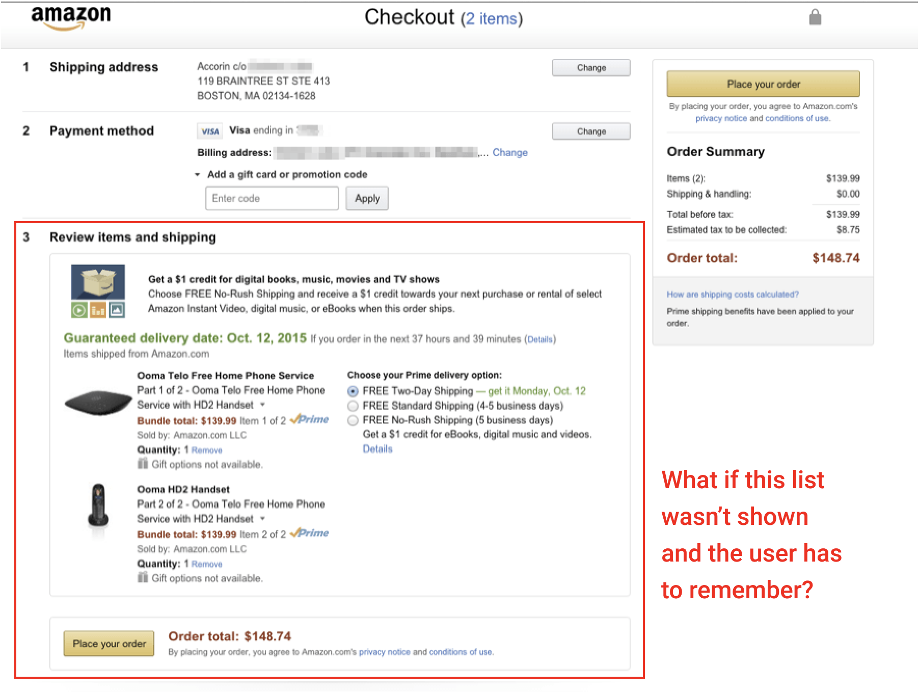
Example for "Showing us the past" would be a checkout list in online stores. If there is no list when checking out, the user has to remember all the things they have selected. Yes, the purchase happens in the future but the items shown were chosen in the past.
In this scenario, humans have limited working memory. By working memory, it is all the points that you are holding in your brain right now. We can only hold handful amount of information. Without the list we are forcing the users to remember. This is the one of the heuristics in Nielsen Norman usability heuristics (Recall vs Recognition).
Note: This is a common pattern. The user likely expects the list in all online stores.

Example for designing past - If the selected items weren't shown, users had to remember, which is not ideal.
Another example would be undo and cancel buttons. These take users back to the past and saves the user from destructive activities. I was writing an article on my phone recently. I accidentally pressed it long and selected all the text. After this, I typed a letter. There was no undo. So, all my work was gone. But designing for the past would have helped me a lot.
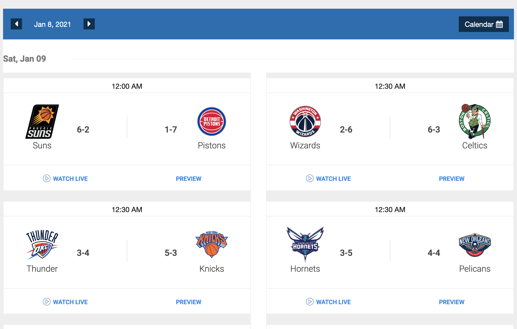
Sometimes, showing the present is the right thing. An example would be scorecards. We won't show future games. We need to show the relevant games which in this case is the present ones. Better yet, you have a date picker to toggle between future and past as we can't say which is the next priority after the current games

An example for present. In the scoreboard, present games are not the priority. Past games are.
Let's go back to the quote. Why did the author choose future there? We design to solve the needs of the users. As we all know, time is unidirectional unless we discover time travel or tenet. You can't change the past in real life. The solution happens in the future for the user. Say a person wants to buy food. The whole act is in the future. You can't order food for your past self. That's likely why the future made sense for the author. However, this is not the case always as I have shown before.
More than present, past and future, design UI for context. In the shooting game, the author wants to know where the bomb will land when he launches the bomb. That's the context designs needs to solve and arc works well.
In the second game, the context is to show directions without any visual maps and make users focus on the beautiful graphics. The wind depicts the direction to move which solves for the context. So, Do no harm. Make things clear. And design for the context.
