Detailed Audit of Subjimandi App [Part 2]
Written by
Vignesh Balaji NV
Preface
You are currently reading part 2 of Subjimandi audit. Please read the part 1 before you proceed with this part.
Part 2 — Visual Audit [current article]
This article deals with the visual audits. One of the major issue we were plagued with is the lack of consistency which leads to confusion and poor experience for the users.
Visual Elements Audit
How I did Visual Elements Audit:
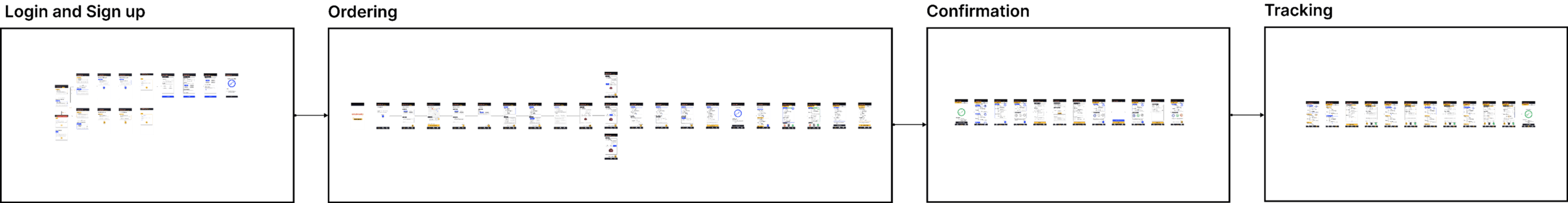
To start with, I put every screen on one page. I mapped out the flows between the screens. I grouped the screens under their respective section. This helped us get a big picture view. It also helped us understand what screens and features were missing/not designed in depth.
We started on the basic atomic elements. These were elements that could not be broken down further. I checked each screen. I collected different varieties under their respective frame. These elements were:
- Typography
- Icons
- Colors
- Spacing
- Drop Shadows
We collected components next. Components are elements which combine the basic atomic elements. The following components were used in our designs.
- Buttons
- Navigation
- Text Fields
- Radio Buttons
- Cards
Typography
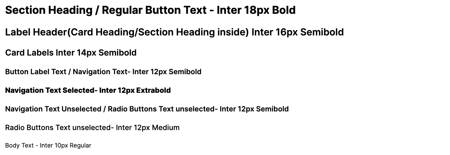
The app currently uses only 5 font sizes which is great. It is generally advised to keep no. of font sizes to be 5–7. But, the majority of type are sized 14px, 12px and 10px. These sizes causes readability issues and advised to avoid them. Often they are used in semibold and bold weights. Those weights in small sizes look like black blocks in 10px and 12px.
Icons
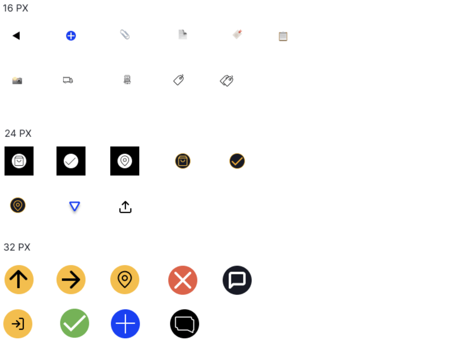
The main issues are:
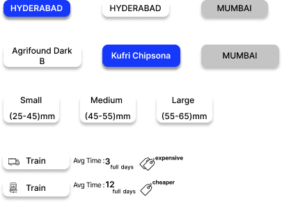
- Lack of base icon grid Icons are not on a grid. The sizes mentioned in the image are approximate size. For example, certain icons are sized in 16X21px. Without grid and visually balancing, same sizes icons don’t appear as equally sized.
Different styles of icons Line icons, icons using negative space, emojis, filled icons are all used. This inconsistency could throw the user off.
- Different thickness of lines Lines found in the UI were sized 0.5px, 0.8px, 2 px, 1.2 px, 2px, 2.4px and 4px. Typically, there is uniform line thickness. You break the rules for visual balance. But there wasn’t a fixed rule in the existing icons.
Other issues found in the app:
The same icons have different meanings. eg: The location symbol means 2 different things: tracking and add location.

Different icons have the same meaning. Eg: The login and signup flows use 2 different button icons. Both have the same meaning(Continue to next page).

Colors
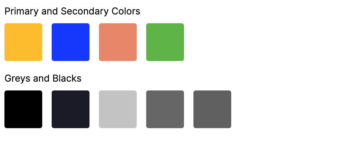
Colors used in the app are accessible and at least AA compatible. The main issue is the purpose/function of each color.
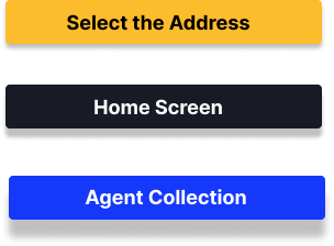
The primary colors are yellow and dark blue. They mean different things based on the screen. Login flow uses yellow and Sign up follow uses blue. In the rate quote request flow, there is blue ‘Add new button’. All others buttons are ‘yellow’ with blue in cards. In the ordering screen, color changes from blue to yellow when the rate quote is received. Colours add more context. But in this case, it creates confusion. There is a little chance of users remembering this. Because of the way colours are used, every element on the screen is shooting for attention.
Subjimandi red is not used at all in the designs except for logo.
Similar saturation of blacks uses different values. The darkest black(#000, #181A26) looks same to the naked eye. 62% #000, 60% #000 represents the same middle grey in the designs. This leads to complexity while maintaining the code.
Spacing
Spacing helps with visual hierarchy, separation and grouping of elements. Poor spacing lead to poor experience. There doesn’t appear to be a logic behind how elements are spaced. Spacing is inconsistent.
Drop Shadows
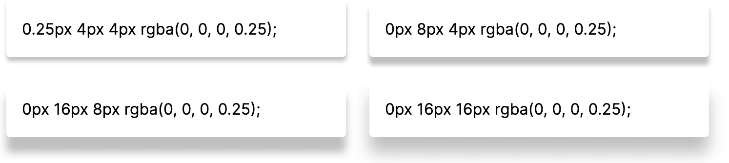
There are 4 drop shadow variants. Drop Shadows in the UI are very heavy. Used well, they give importance to the applied elements. Since the elements are small, these shadows feel artificial in the UI. These don’t feel part of the UI. Look at button examples below.
Buttons
There are 4 styles of buttons. Even under each type, buttons are inconsistent. Different styles perform similar actions in the interface.
Circular icon buttons(FAB style buttons)
Subjimandi app uses icon buttons as a FAB button and as a regular button. FAB buttons are typically used to denote the main primary action on the screen. However, in the app, it is also used for regular buttons. With separate regular button styles, they only add confusion. The text which indicates the action is not legible. The icon takes the attention away and people could skip the text.
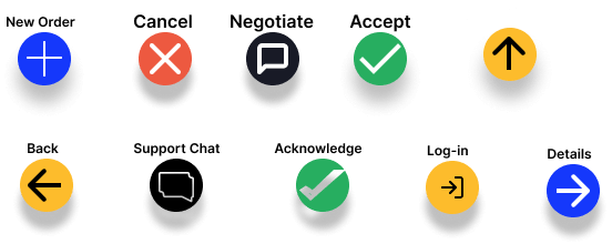
Regular button
Used in certain places to take the user to another section. The drop shadows are inconsistent.
Secondary buttons [Add new location/Save address]
Text does not look like it is clickable in the UI. People will have to play with the interface to know they can click the text. Icon sizes are also different.

Yes and No buttons
These look like radio buttons used in the design. Clicking Yes and No buttons takes the user to the next page. The radio buttons selects an option. Both are styled same but perform different tasks. It is important to remove this ambiguity.

Both circular icon buttons(FAB styled buttons) and rectangular buttons act as primary buttons. Typically, there is 1 primary button styles.
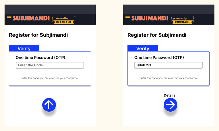
The FAB buttons perform additional functions in certain screens. In the login flow, the next icon is replaced by an upward arrow. This signifies an action is needed from the user at the top(filling the text field). This is not easily understood. Users have to figure out what they mean. There are better ways to notify users.
Navigation
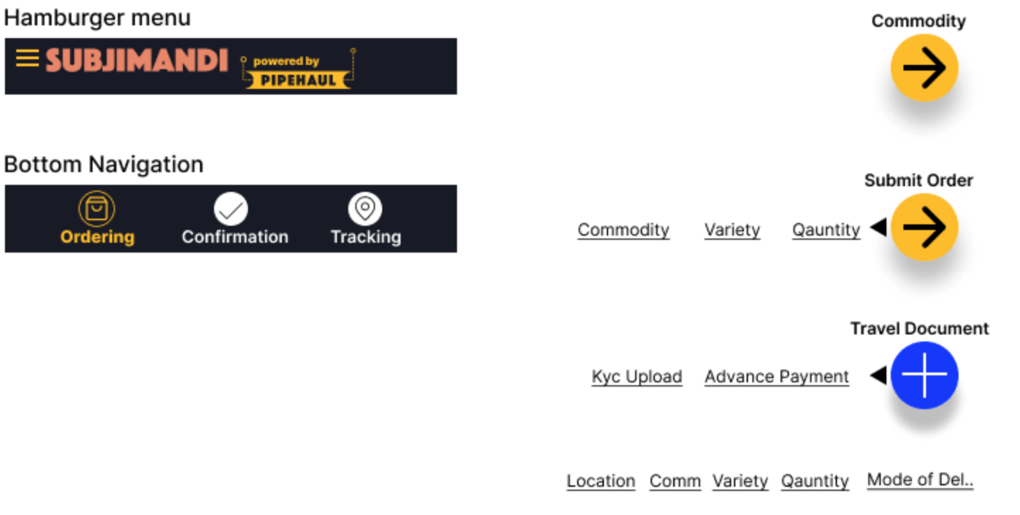
There are 2 main primary navigations on the home screen:
- hamburger menu
- Bottom navigation
Using both as top-level navigation confuses the users when there is a way to use only one. The hamburger menu is not as visible and gets lost with all the vibrant colors.
The unorthodox bottom navigation allows users to jump between sub-pages of a section. It has links to different pages as well as a button(go to next page). In the beginning, it is empty and more links are added as you move further into the task. This makes it difficult to know how many steps to finish the task. It is easy to learn, accessible under the thumb. People can go back to a particular page much quicker. Currently font size is very small to read. Increasing the font size makes it difficult to put them in a row.
Text Fields
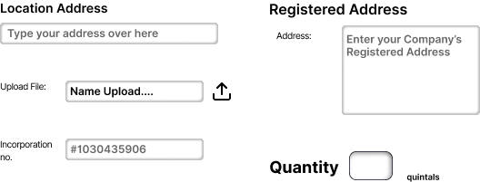
The height of the text field is 24px. It makes it difficult to click on the field. Labels are either inline and above. This leads to inconsistency. Quantity field has its unique style. It is expected to have small input. But if the user enters 4 digits, the first digit is not that visible any more.
Upload field looks like a text field and needs a proper upload button.
Radio Buttons
The select options look like rectangular buttons. Radio Buttons allows the user to select an option. The element needs to be more clear. In order to accommodate additional information, there are different styles of select options which creates more confusion.
Cards
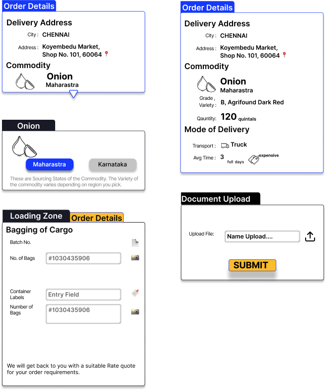
This is the main component used in the app. Everything in the app is a card. The components compose different elements: text, images, text fields, select options, buttons. They engulf all the information and group them. They are also used as tabs. Certain situations they are clickable cards. Certain types, they are not. It is usually represented by small arrows which could be missed. Using cards for everything may help with quick development. But it leads to ambiguity and reduces the overall experience.
Conclusion:
To summarize what we learnt from this:
- Showing the relevant information at the right time
- Simplifying the user flow
- Building for the buyers and not for us
- Dealing better with constraints
- Having more consistency visually, so they all look part of the whole
Before I was joined, there were insights learned from the operations. We are combining that and lessons learned in audit to prioritise what needs to be done in our next cycle. We are simplifying our information architecture and user flow. We are creating a unified visual design. We do plan to fix most of the important issues in the immediate cycles. Thank you:)
Thanks to Tom Kerwin, Anneli Olsen, Susan, Anthony Hobday and Designer Hangout slack channel for explaining about audit process.