Detailed Audit of Subjimandi App [Part 1]
Written by

Vignesh Balaji NV
I joined Pipehaul as a product designer in May. Pipehaul works in the long distance logistics field. Pipehaul transports cargo from regions far apart. Subjimandi, one of the stores we run is powered by Pipehaul’s Logistic network. In Subjimandi, we help our customers buy graded produce such as onions, potato, etc. from the agricultural(production) regions. We transport the produce using our logistics network.
To get me started in my new job, we decided to do an audit. It was in development since the past one year. It was important to take stock of where we stood. We wanted to know what we were doing well and what we were not. This would help us prioritize what to work on in the coming months.
We decided to audit from 2 complimentary angles.
Usability audit
The main goal of our customers is to buy produce. In this audit, we checked if they were able to achieve that goal. Some questions that we considered were “What was the experience of using the app?” “What are the frustrations, confusions and ambiguity faced by them?” “How are we handling the error states?”
Our target users are already buying produce through local markets and other means. If we want to convert them to our product, our app should be usable. It should have a good experience. If not, they would not migrate to our product.
Visual Elements / Consistency audit
This audit is about the consistency of the visual elements. “Are we using consistent styling?” “How are the icons used?” “How many colours are we using?”
The purpose of the audit is to figure out if our users get a consistent experience in the app. Often inconsistencies lead to confusion. For e.g.: if the same icon had 2 different meanings, it could confuse them. Creating consistent elements lead us to maintain less code. When we are building a design system, we would have a base to build on.
In the part 1, we will read about usability audit. In the part 2, we will read about visual elements audit. Note: usability issues of individual elements are discussed in the visual elements audit for clarity.
Part 1 — Usability Audit [current article]
Usability Audit
How I did usability audit:
I walked through the whole flow from onboarding to delivery. I noted how I was feeling at each step. I checked whether I was able to do the task. I also checked the error states. Obviously, I am not the user and it is important to do user research to evaluate usability. However, we could definitely find and correct basic flaws based on heuristic principles and other laws.
We built the app for us and not for our customers.
This is the most important thing we learned from this exercise. Let me explain with an example. There is an existing paradigm on how online stores work. When a person is buying online, they want to see what’s available. They browse all available products before they decide to buy.
How does our user see what’s available?
- Start a new order
- Select delivery city and enter user address
- Check available produce
From our perspective, the app is for getting orders from our buyers. From the buyer’s perspective, it is to buy produce. Instead of mapping our process to existing paradigm, the IA and task flows forced users to adapt to our processes and mental model.
I will walk through the whole flow and point out the main issues we found. The goal of the user is to buy produce. How does that happen? There are 4 main sections:
- Onboarding section: Sign up/ Log in into the app
- Ordering section: Start a new order. Select delivery location and enter delivery address. Select produce, subvariety and quantity. Choose transportation option. Request for a rate quote. Accept, negotiate or decline the rate quote
- Confirmation section: Filling company info and payment
- Delivery section: Delivery details and transit documents
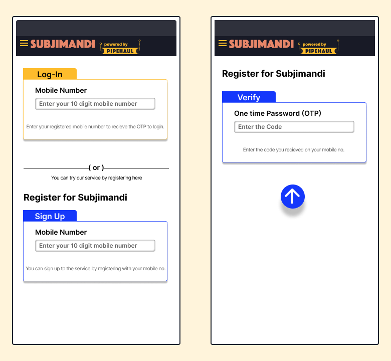
Onboarding section
Logging in using phone number, although not as secure, is very intuitive. First-time internet users are already familiar with phone numbers from a younger age. It needs strong authentication process than OTP. The login and sign in fields are going to be on the same screen. It may seem like a good idea because it avoids a click for the user. But users have to think which mobile field to click which leads to confusion.
Ordering section
As a user, I want to see what produce is available. Right now, I have to do the following steps to know what produce is available in my region.
- Start a new order
- Select a delivery city
- Enter the delivery address
- Go to next screen
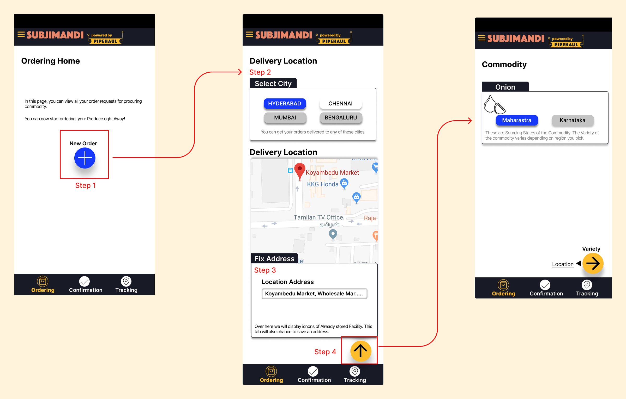
This should have more clarity. The first thing user needs is to see what’s available. User may drop off now because they don’t trust Subjimandi yet.
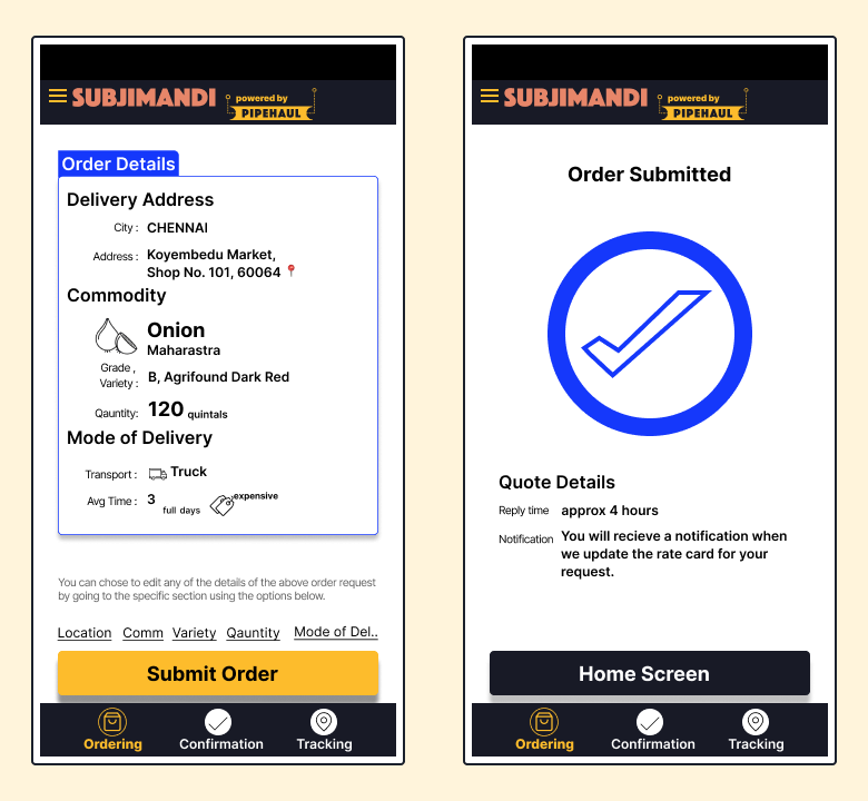
Requesting a quote
Here are the steps involved to request a rate quote:
Selecting a delivery address
Select city and fix address appear as separate sections even though they are part of delivery location. ‘Fix address’ means action users do on the map. The section heading so far are titles.
Google Maps do a poor job of picking up the correct address in India. The narrow streets are not mapped well so the user is forced to manually enter the address in the ride-hailing and food delivery apps currently. Besides, removing Google Maps means one less dependency on Google.

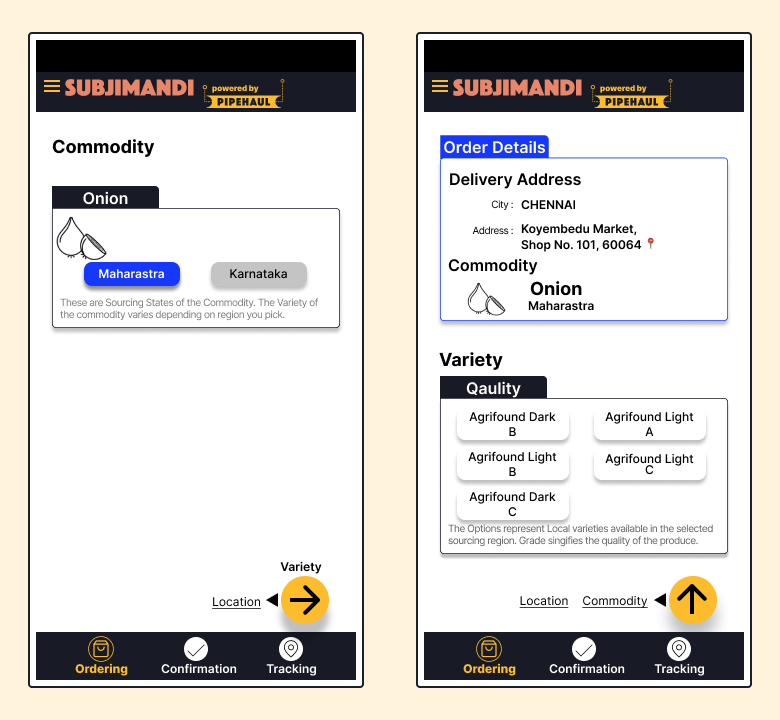
Selecting produce and its variety
Combining produce name with the region makes sense as our users refer to produce similarly. There are various types of onions as well as various types of grading for each variety. However, in the “Variety” screen, the section is titled ‘Variety’ even though they select variety and quality(grading). The title may confuse the users.
Most of our customers understand different variety names like Agrifound Red. We could make it accessible to non-industry experts by explaining to them.
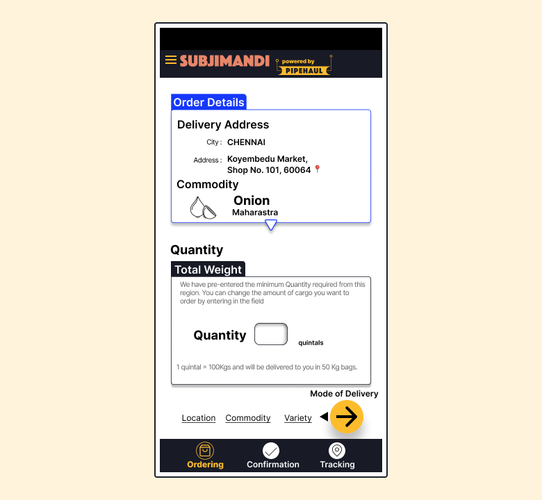
Selecting quantity
Showing the minimum quantity next to the quantity field provides users with the right information. Minimum quantity is pre-filled. Once users enter a value, it is gone. If they forgot, they have to refresh the page. Customer may like to know the minimum quantity before they start the process.
Selecting transportation
Adding more context for selecting the transportation system helps the user choose the right option for them.

Order request overview:
‘Submit order’ is confusing for the users. From Pipehaul’s perspective, we get an order in the backend. From the user’s perspective, a request for a rate quote is made when they click. When they accept the rate quote, it becomes an order for the users.
Dealing with constraints
In a physical market, the customer gets a price quote almost immediately. In our app, it takes 4 hours to get a quote. (We are taking efforts to reduce it to 2 hours very soon.) It is a trade-off for the user. They get access to the production regions which they otherwise don’t. Production regions require a large minimum quantity. The cost of produce changes on an hourly basis in the production regions. We enquire about the rates from the sellers and choose the best rate. It is important to convey this information to our user. However, this information is known to the user after requesting a quote. The user should be informed of this before.
Confirmation section
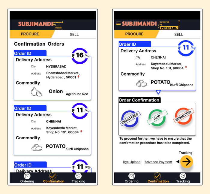
Disclaimer: Right now, this flow is not live because it isn’t feasible to do. We have to reach a scale to link payment processor. So, I used the design files to audit the flow.
All rate quotes request are listed on the home screen. The color of the card changes to signify that the rate quote has been received. It can be missed easily. The title changes from Order received to Quote Submitted which people can scan past.
Another main theme in the audit was not showing the relevant information at the right time. Rate quote is not available readily. The user has to click on the card to expand for more details. Click on ‘Go to Rate Quote’ to see the rate quote information.
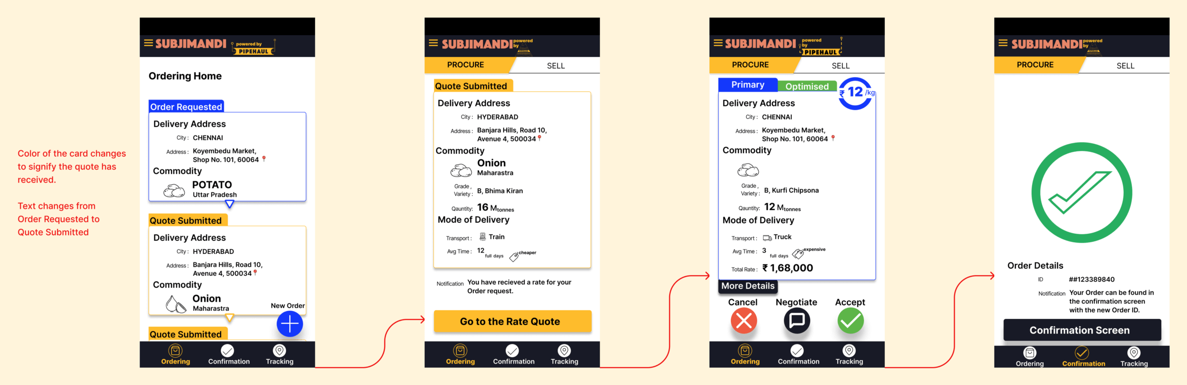
Once you accept the rate quote, the order is moved to Confirmation Screen. This requires learning a new behaviour. The user might think it is already ordered. However, payment and business information are yet to be collected. The users are not aware of it.
The steps in the confirmation flow are logical. Entering the company’s info -> Payment Process -> Travel Document(Not sure what this means as a user). The status of each step is huge and prominent. But the action for completing the task is displayed as a FAB Button with a small text above. Based on priority, the visual hierarchy should have been reversed.
Delivery section
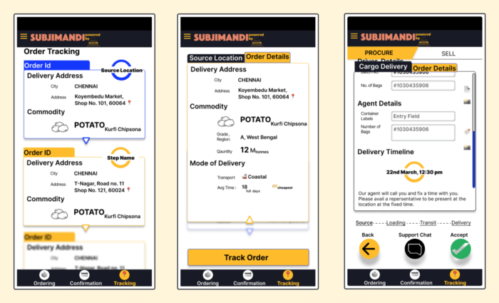
Like with the previous section, the right information is not readily available to the users. In this case, time of delivery information is buried.
Delivery section is even more confusing because of the way the information is displayed. Once you click on an order, there is a tab next to the details. This shows the current stages of the produce. Confirmation and Delivery section uses 2 different models. There are 4 stages(Source, Loading, Transit, Delivery) in this section. These are the operations that are done in the backend. Time of delivery is only available after it reaches the last step even though approximate date is mentioned in the rate quote.
The delivery information are in a separate tab which seems like a separate thing. The bottom navigation helps to navigate between sections. But there is no expectation of no of stages at the beginning. Being transparent with users is great. At the same time, the information has to be structured so it is consumed easily.
Pit stop:
This Visual Part of the audit will be covered in part 2. This exercise led us to refactor the entire flow and information architecture which was released recently. Thank you!
Thanks to Tom Kerwin, Anneli Olsen, Susan, Anthony Hobday and Designer Hangout slack channel for explaining about audit process.